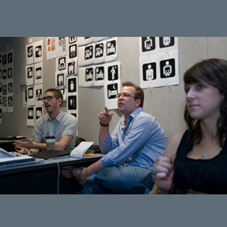
These symbols may be tested this fall at four hospitals across the nation via surveys taken among the populations in three Midwestern cities. This is as per Yolanda Partida, director of Hablamos Juntos (We Speak Together) who is based at UCSF Fresno Center for Medical Education & Research.
The project challenge for students is apparently clear-cut but extensive. They have to develop symbols that may escort any population who speak any language and represent any reading or education level, to definite points in a hospital or other health-care settings. So, for example, they have to develop a symbol that could correspond and steer users to particular service areas like hospital admission, dental care, genetics counseling, mental health services, ophthalmology, nutrition counseling, pathology, radiology and more.
Oscar Fernández, UC associate professor of design, led the project. The students from the University of Cincinnati started working on signage proposals in January 2009. In the present summer quarter, about 16 students are now completing up their health-care symbols and getting prepared to test the symbols this fall. Adding to it, students from California Polytechnic State University, Iowa State University and Kent State University have also been developing symbols to be part of the fall 2009 test group. As per Partida, every school was asked to develop 15-20 symbols that may be joined to a collection of 28 symbols which were created by professionals and is nationally already in use.
Apparently a first round of testing on the student-created symbols may start in September 2009. That’s when students’ final symbol designs may be assessed in a sequence of identification and comprehension tests. The symbols which appear to be the best performers in terms of comprehension and recognition could then be included into surveys administered in pockets of language groups (both English and non-English speakers) in Cincinnati, Ohio; Kent, Ohio; and Ames, Iowa.
Lastly, the symbols that may ‘make the grade’ in terms of this community user survey/testing could be made obtainable to actual health-care settings and pilot sites. Grady Memorial Hospital, Atlanta, International Community Health Services, Seattle, The Children’s Mercy Hospital, Kansas City, and Women and Infants Hospital of Rhode Island, Providence, R.I. are some of the following health services which are already working to implement health symbols as signage.
UC graphic design senior Jesse Reed, 22, of Youngstown, Ohio, mentioned that the testing of the student’s work could be both the most rewarding part of the project or the biggest letdown. That’s when it’ll be seen if the users understand what they are trying to communicate. He thinks that his designs may be effective but users’ reactions will certainly be the real test. He added that they want to have the least amount of parts or elements possible to communicate a very specific message.
UC digital design student Paige Farwick, 22, of the Cincinnati suburb of Eastgate explained, “We began our project by going out and asking non-designers to do a quick, rough sketch of the specific terms we were looking at. For instance, I asked family members to sketch the first thing they thought of when I said the term ‘in-patient.’ They all sketched a rough outline of a hospital building. It’s probably not what I would have first thought of as a designer, but it gave me great insight into how a public audience thinks of that term.â€
As designers, the UC students are taking their job further than the approved outlines of the project which focuses on symbols for the physical health-care setting. Nevertheless, they have also chose to look at how the symbols might interpret to other platforms, like the Web, printed materials such as brochures or even a nurse’s call button.
UC’s Fernández commented, “In order for these symbols to be effective in the physical environment, it’s important that users become familiar with them and see them used across platforms – in the physical realm, online and in other settings. So, we made a point to look at the symbols in the totality of environments (physical and electronic) where they will likely be used.â€
Testing may be finished by December 2009 and modifications may be required for the student-created symbols. The final aim is to have the symbols adopted nationally as well as internationally.
A creation of symbols that may be used for prescription labels is a fresh challenge that Partida would like to take on with the assistance of UC’s School of Design.
Partida mentioned that they submitted a proposal to the National Institutes of Health. They already know that the symbols currently in use for prescription labels are not apparently effective. They would want to apply user-oriented design principles in a similar manner to their present project.
